A designer's perspective: How Vectary approached a re-brand
The Vectary brand refresh may appear simple, but not from a design perspective.
If you've been using Vectary over the past few weeks, you've likely experienced the improvements we've been making to our platform. They were designed to streamline the 3D design process and ultimately make 3D more accessible to a greater number of people.
We've also taken the opportunity to make some changes to our overall brand so that it's more representative of who we are. Before we share more on the new brand changes, it's important that we consider some of the steps that lead us here.
A retrospective
As a 3D design and Augmented Reality (AR) platform in 2018, incorporating 3D into our brand design felt like a natural fit. The plan was to find a 3D shape that represented the letter 'V' in Vectary. This shape also had to be unique and identifiable.
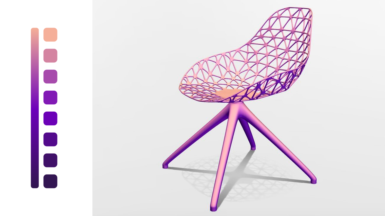
Color inspiration came from our own material capture (MatCap) shader. We'd been using purple and 'peach' for years. It was a source of inspiration for a color palette that felt symbolic of our journey at that point in time.
"I'll never forget how beautiful Vectary Studio editor was when I saw it for the first time. Especially as similar platforms were comparatively boring using mostly shades of grey," said Ondrej Mitko, designer at Vectary.
Why the previous logo didn't work in a digital world
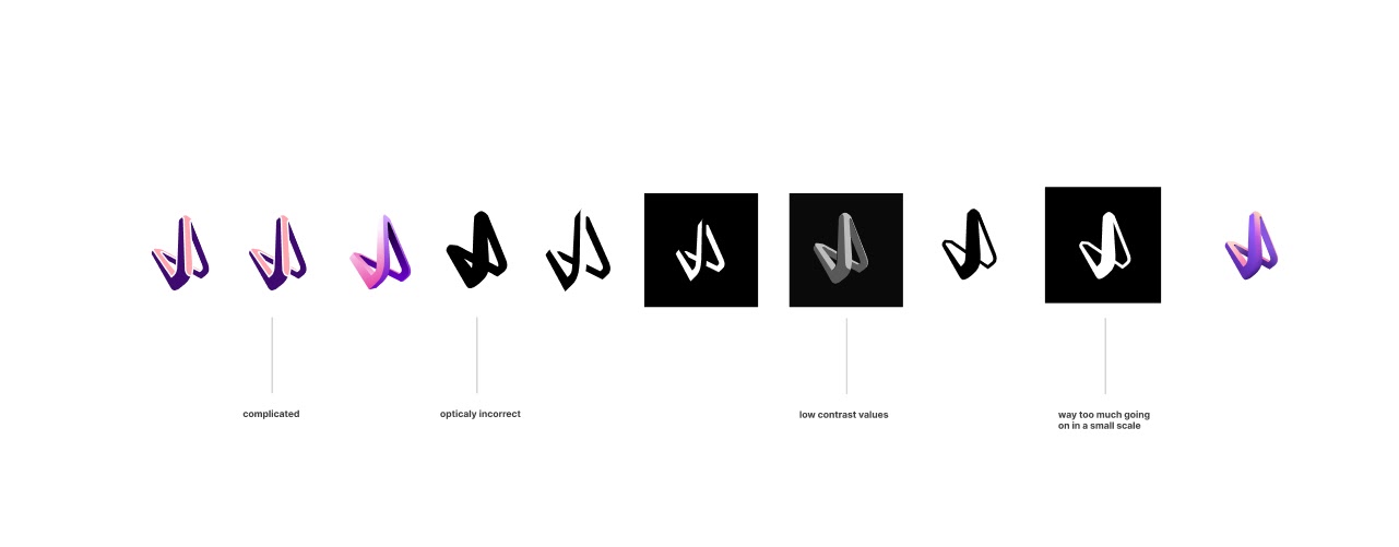
- It didn't scale. Branding on digital platforms requires flexibility. Sometimes you have an entire screen, other times you have to communicate the essence of a brand with just a few pixels, like with a favicon. After scaling to a certain size, the previous logo wasn't recognizable
- V is for 'very popular.' From a design viewpoint, the letter 'V is rather restrictive. Not only is it a surprisingly regularly explored letter, as a shape it's essentially just two lines
- It wasn't recognizable. The 'V' in the logo was definitely unique but no one recognized the letter
- 3D logos require definition. Lighting is one of the important components for adding realism to 3D online. In terms of design, this means a 3D logo requires gradients, shading, and shadows. This isn't practical for broader applications of a logo
- It wasn't Vectary. Broadly, while there were more design or technically related issues with the logo, it didn't represent us and our vision. It didn't represent sophistication or powerful simplicity.
What's in a logo?
A logo is the main symbol of a brand and needs to work across a wide variety of applications. Color forms a core component of a brand's identity and therefore needs to be reflected in its logo.
One of the cardinal rules of good logo design is to start designing in black and white. It makes a logo much more versatile, particularly in unconventional applications like printing. For example, some colors aren't supported by printers and can't be accurately reflected, affecting brand consistency.
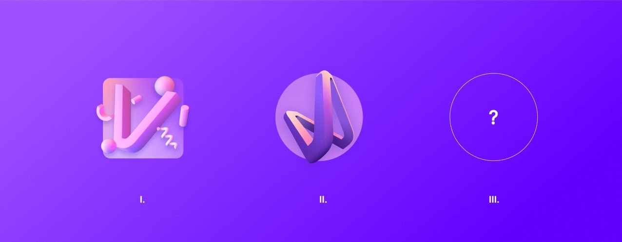
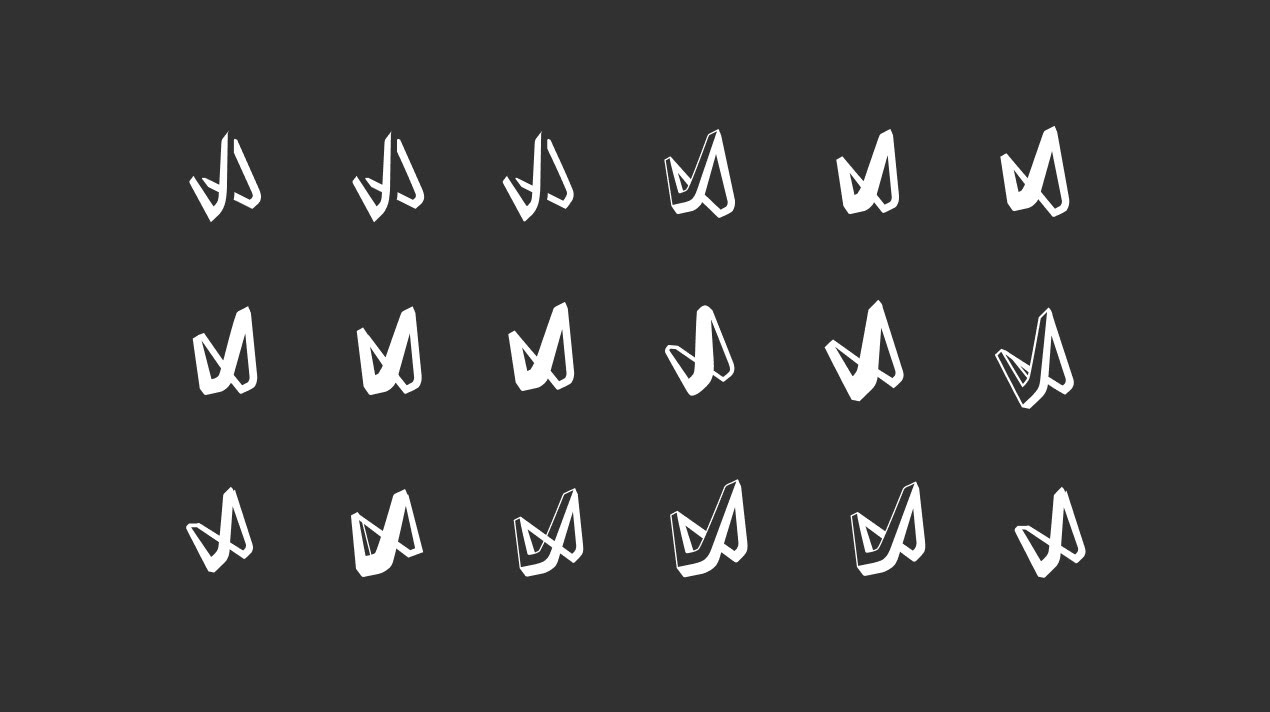
A temporary solution
An updated, flat version of the logo was created. It resolved some of the previous issues and offered a short-term solution. It still maintained a unique shape while making the 'V' more prominent and had a stronger level of detail. But we still needed something that aligned with our vision and mindset.
A new approach in 2021
Working towards the final logo, an initial idea was to use shapes to create the 'V' and a broader visual language that would work across our design system. This formed 'building blocks' while also aligning with design trends at the time.
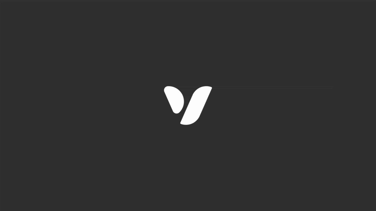
We wanted to create the letter 'V' from at least two shapes. This provided a creative challenge and a new perspective for one of the most commonly explored letters.
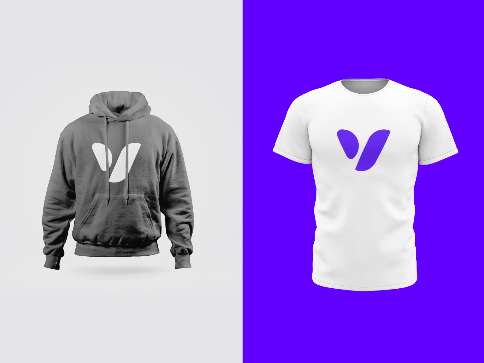
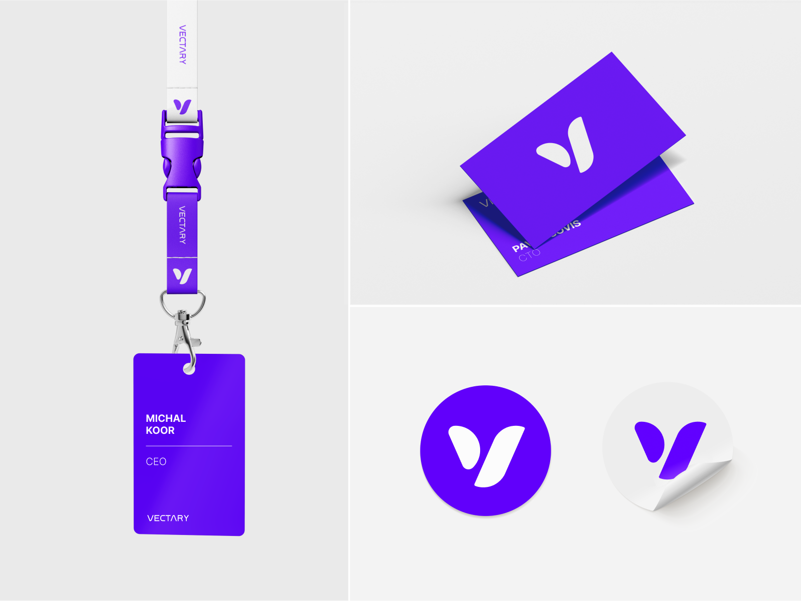
Our CEO, Michal Koor, really wanted to emphasize collaboration through the logo. We were also inspired by a sense of community (particularly the no-code and 3D design communities) and felt that the small shape in a way represented us, with the bigger shape being symbolic of community and collaboration.
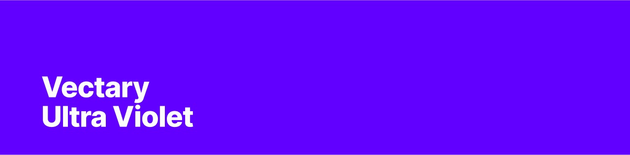
In terms of color, we intentionally moved away from the original gradient and wanted to take the opportunity to formulate a new color scheme. This allowed us to move away from the more pastel colors, like 'light blue', while embracing a bolder color palette with purple/ultraviolet.
"Purple plays a huge role in our visual identity. When we wanted to refresh our color palette, we opted for something that was more vibrant. Our new shade of purple, known as Ultra Violet, represents a spirit of bold playfulness. It's not your typical shade of purple, not something that you come across on a daily basis," added Ondrej Mitko.
We see our brand as being a living reflection of who we are. It definitely consists of more than simply a logo and colors, but an introduction to who we are as a company, as designers, as believers in the evolution of content creation.